How does a new cider brand grow from local roots to national reach?
Creative Idea: Crafted with History
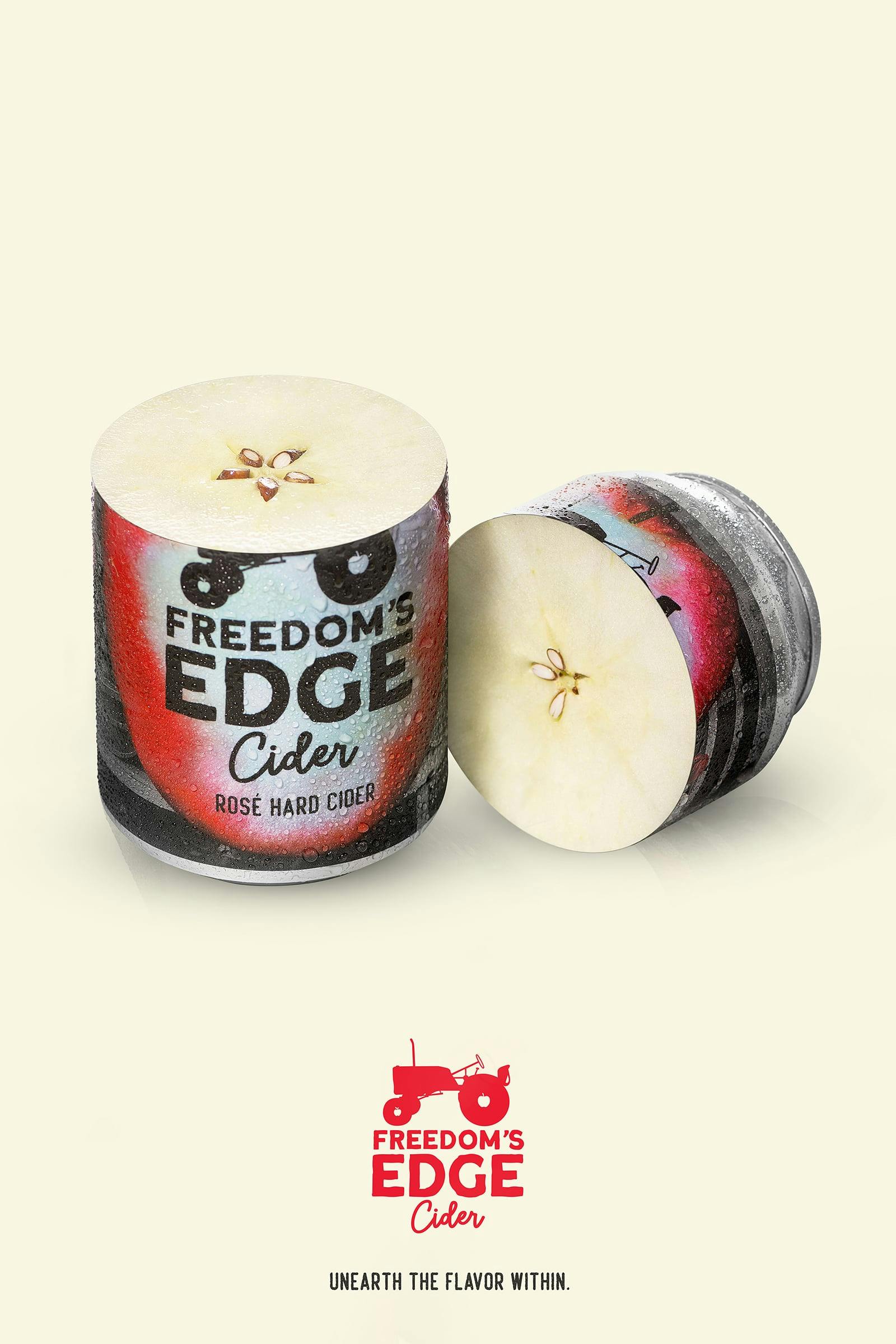
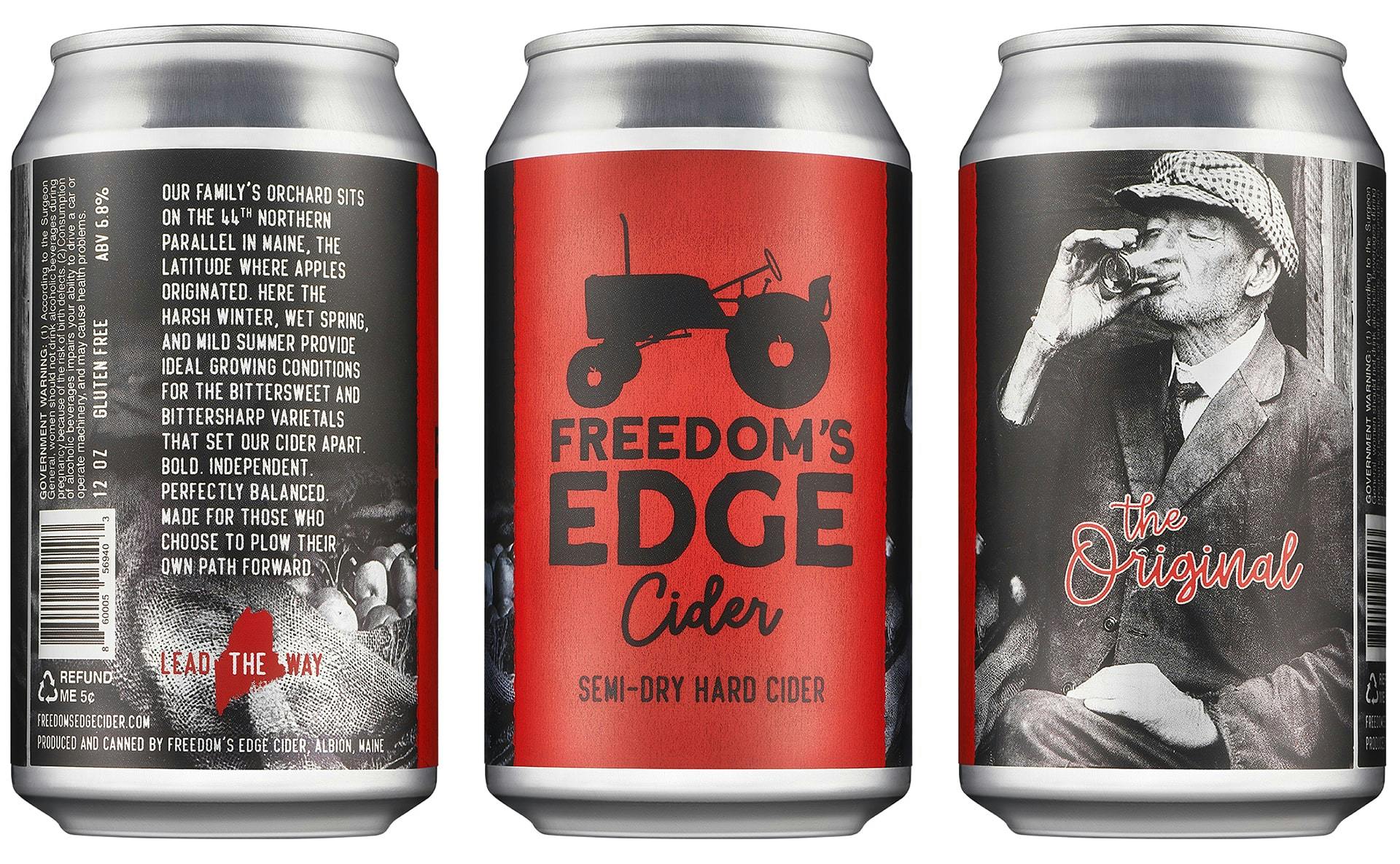
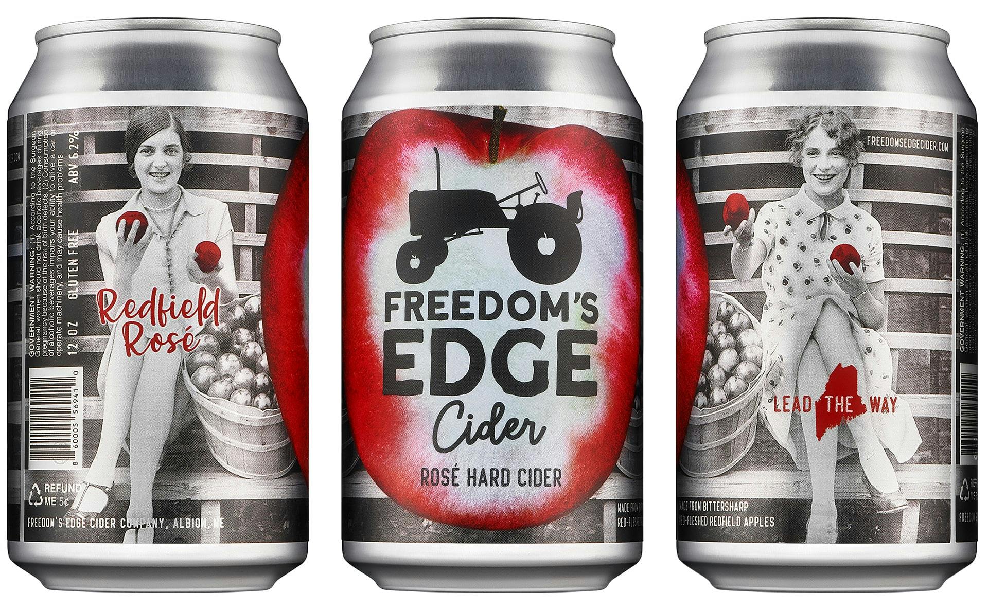
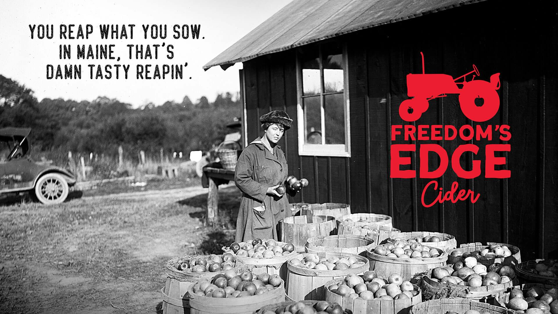
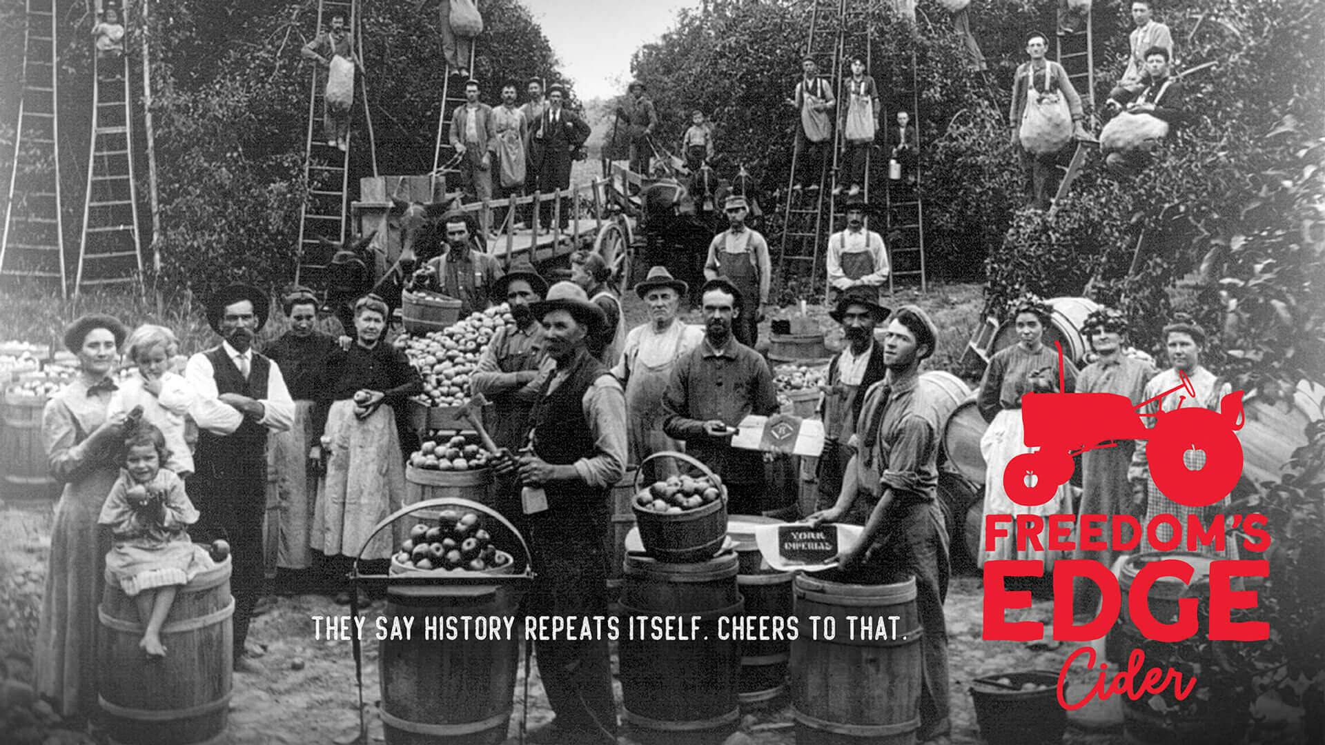
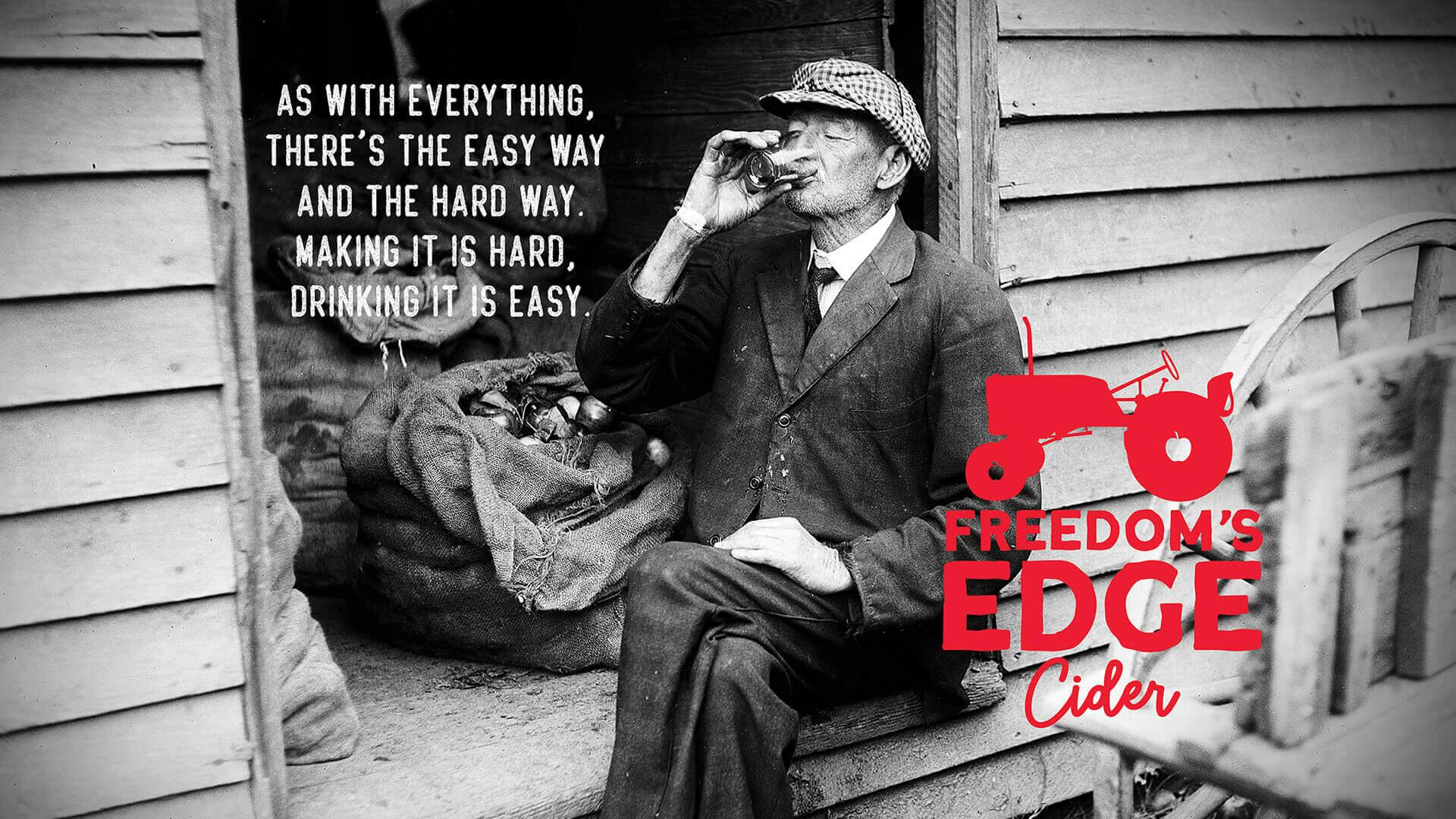
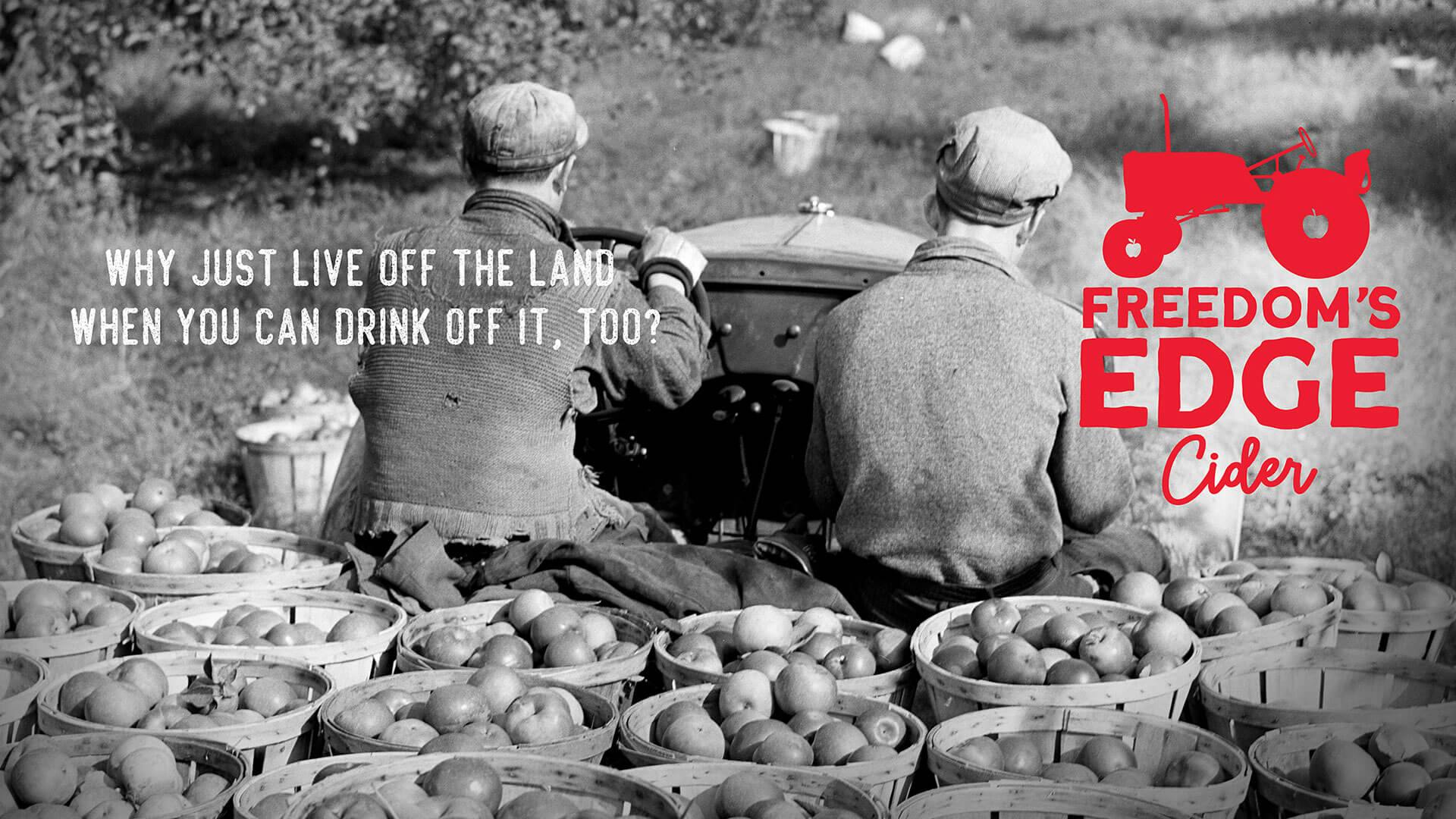
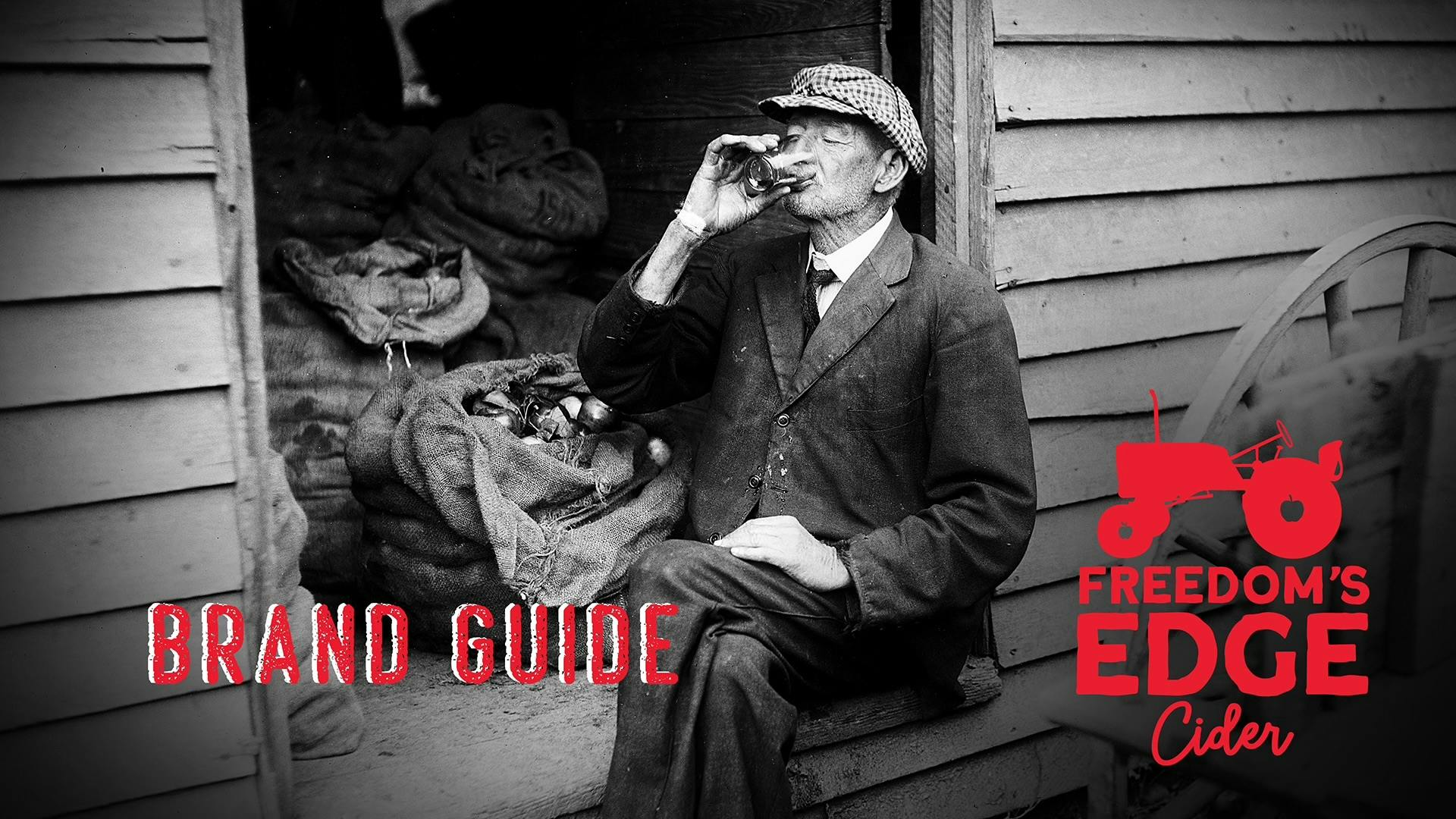
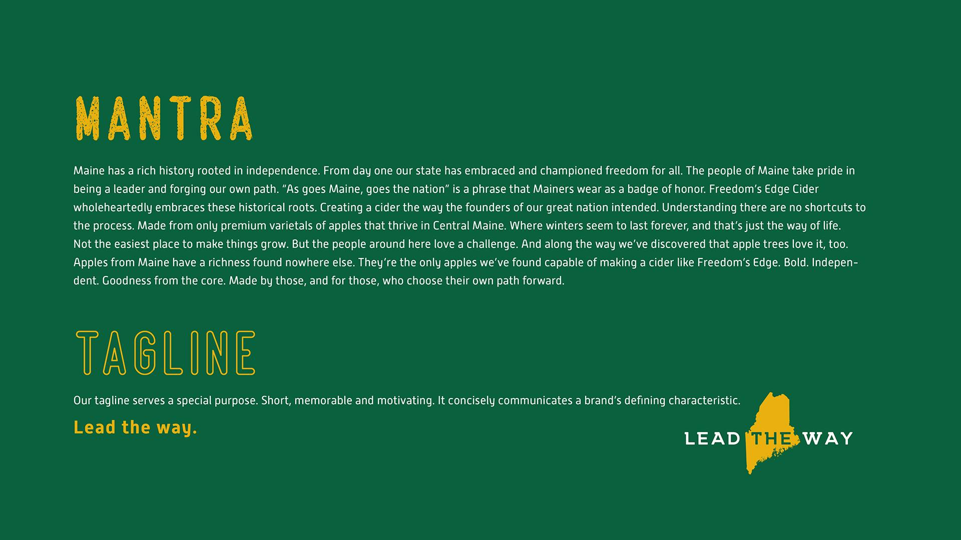
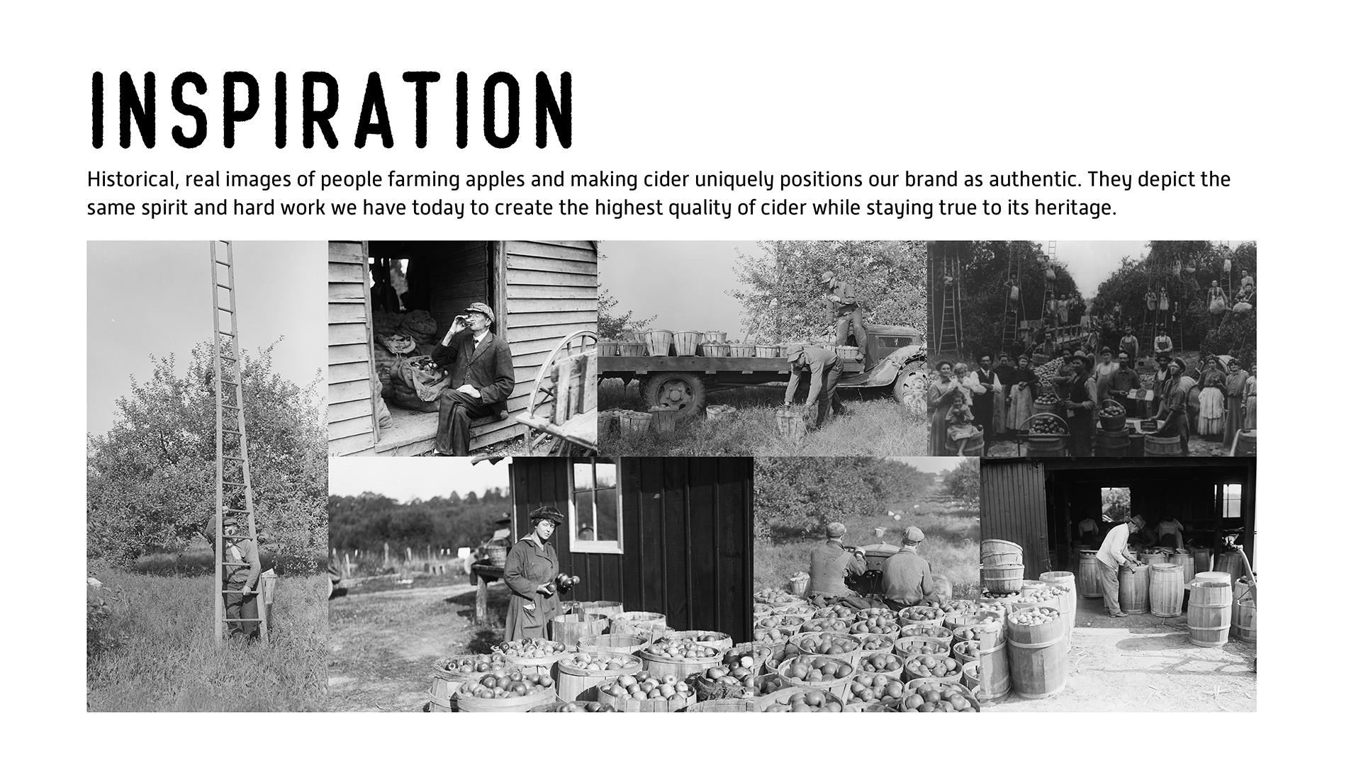
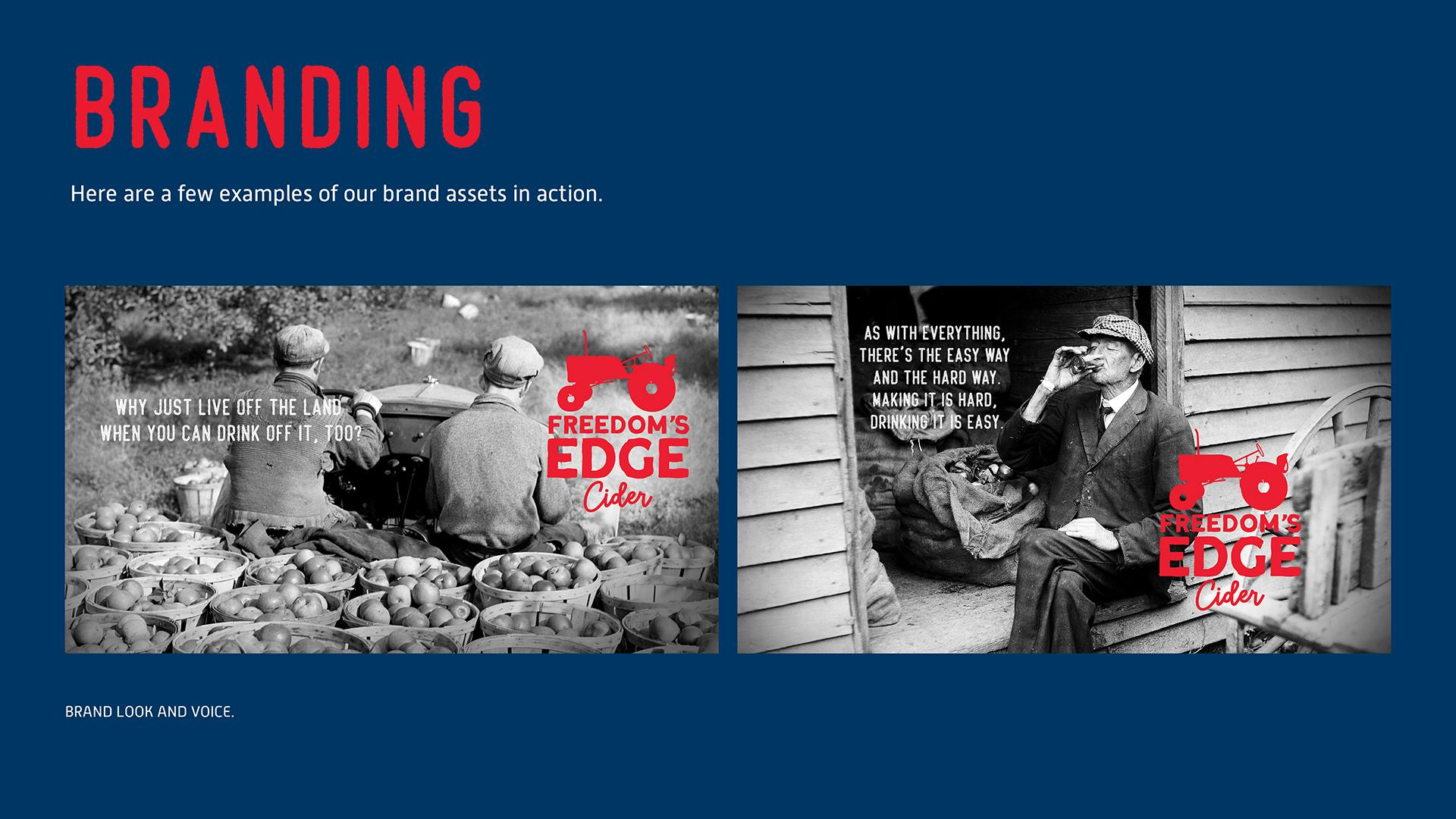
We worked hand-in-hand with the founders to make sure we were creating an authentic brand that was true to their vision. Maine has a rich history of cider and in this case, history repeats itself. So we used real historical images from the region to bring the brand to life. What we created together is unique to the cider industry and is quickly expanding beyond the borders of Maine.


Brand Identity: Heritage Meets Bold Design
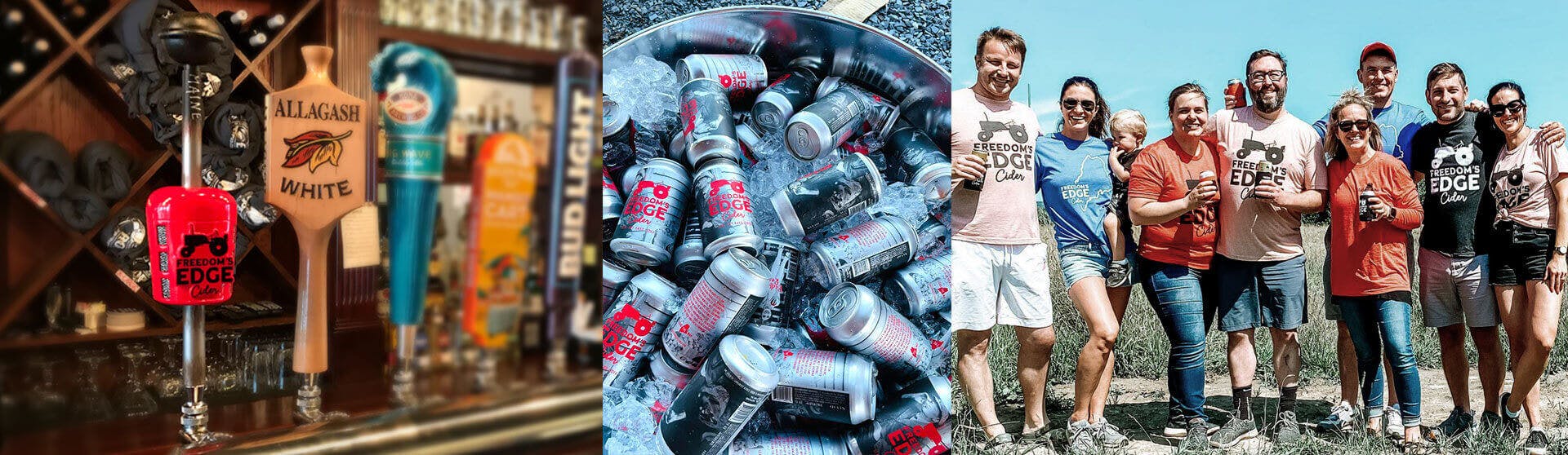
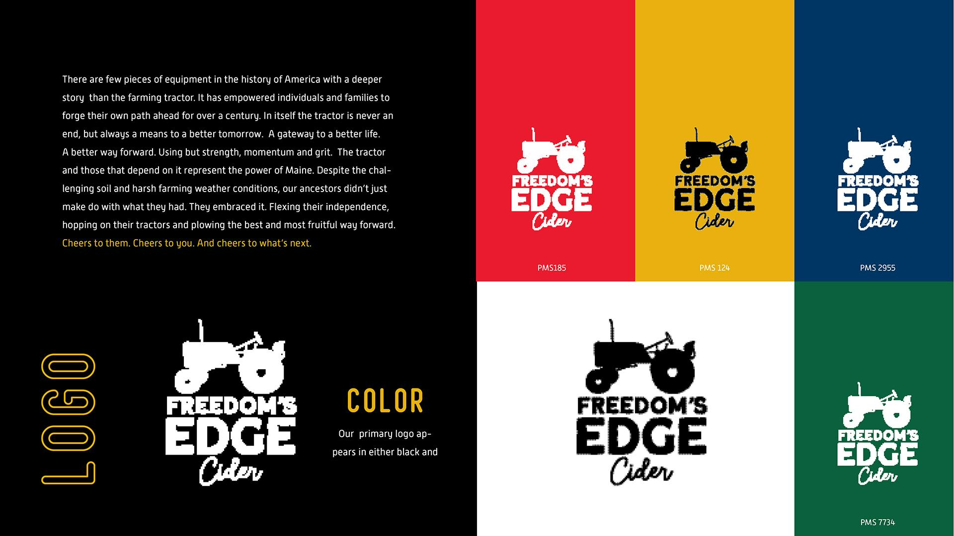
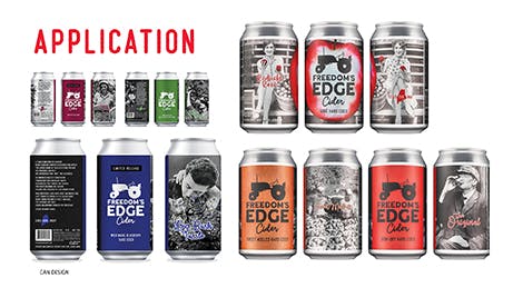
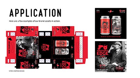
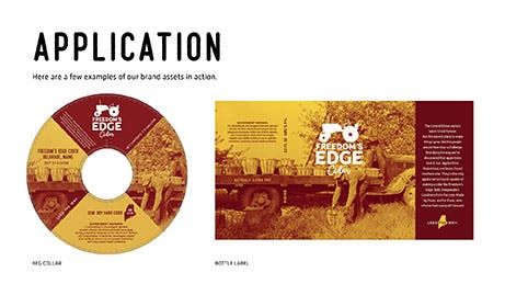
From packaging to tap handles, every touchpoint captures the brand’s sense of place and purpose. The iconic tractor-gear-shift tap handle became an instant conversation starter across Maine bars—symbolizing both hard work and good times. The visual identity celebrates the grit, humor, and history of the region while giving Freedom’s Edge an unmistakable shelf presence.


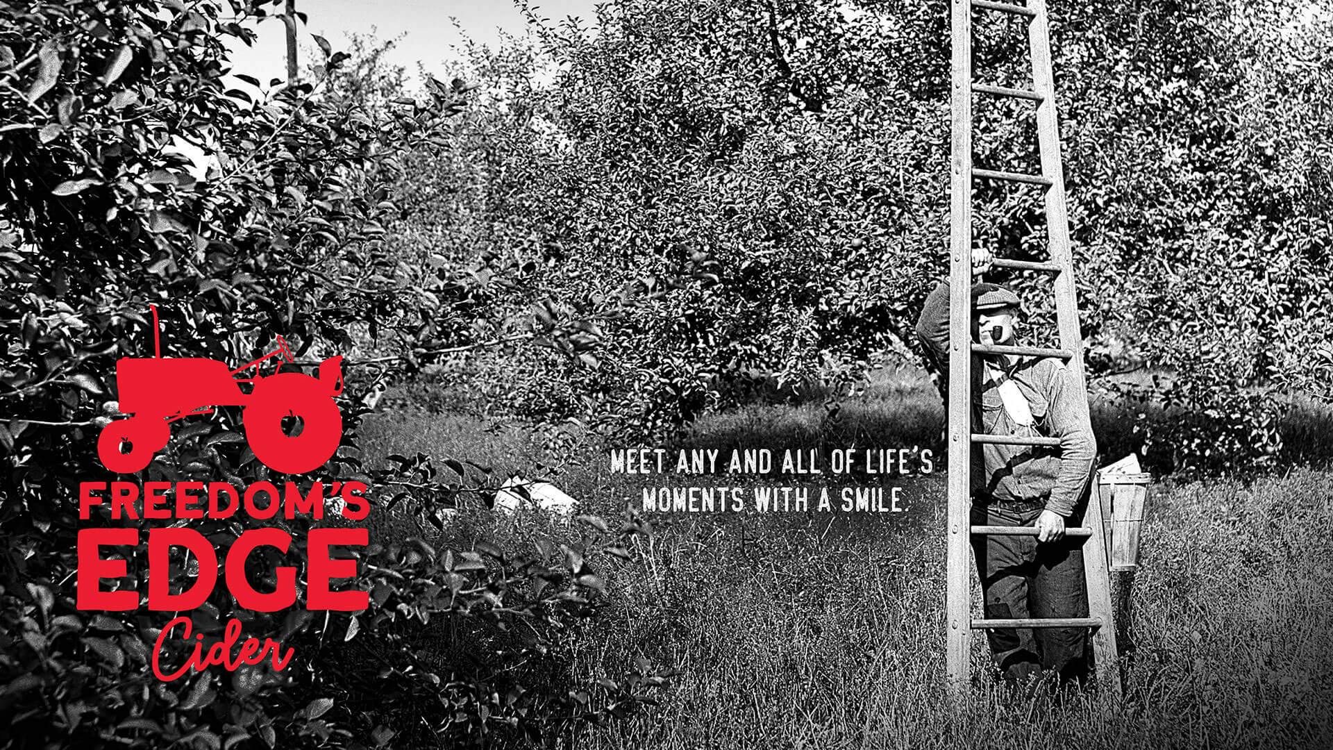
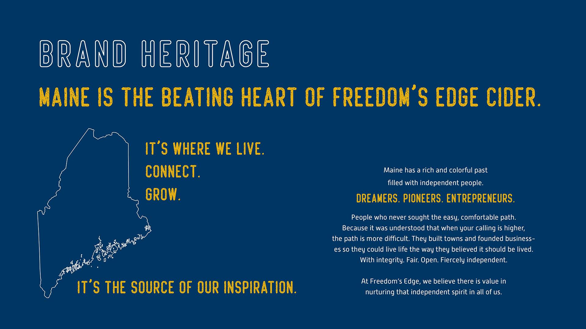
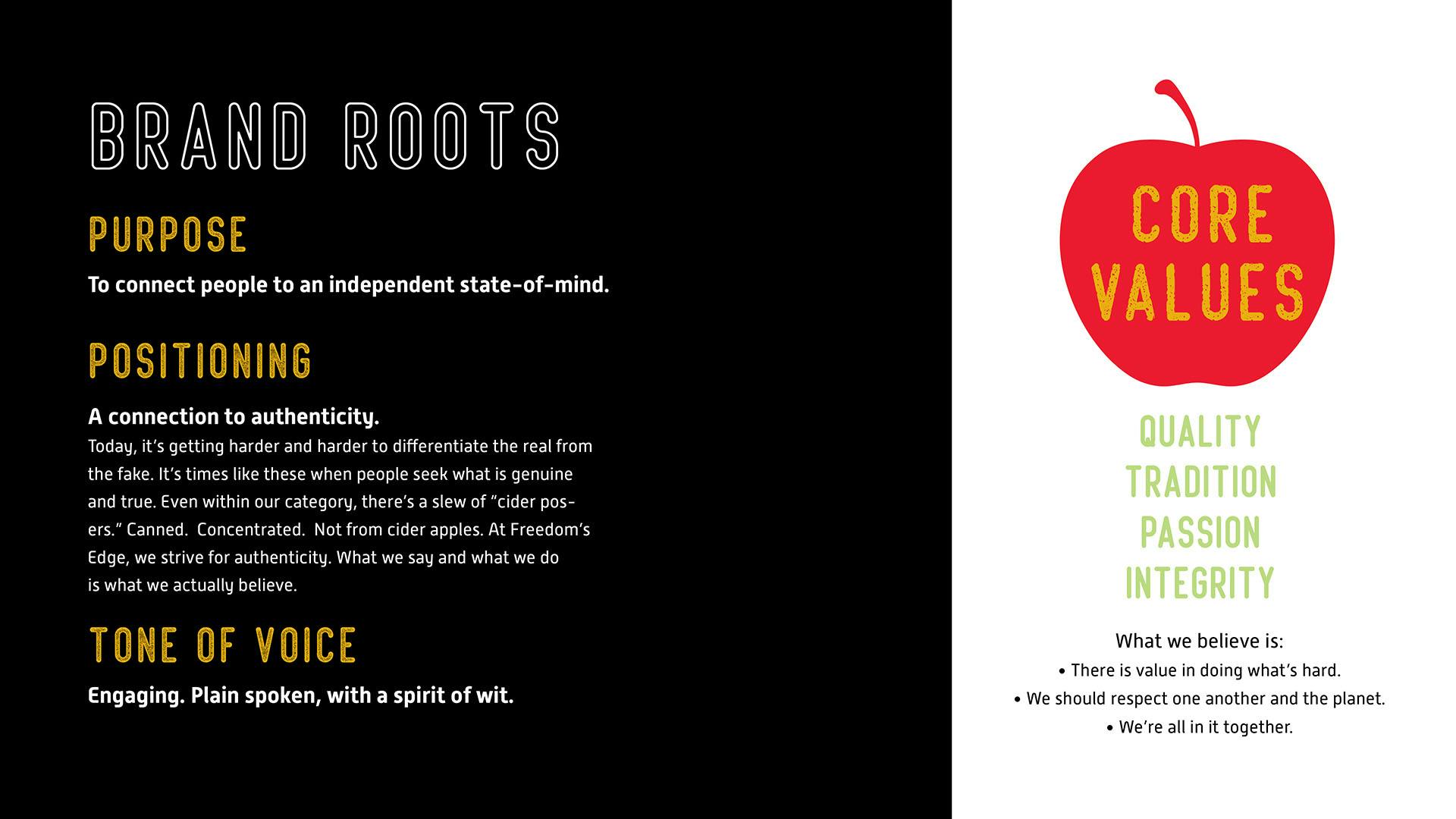
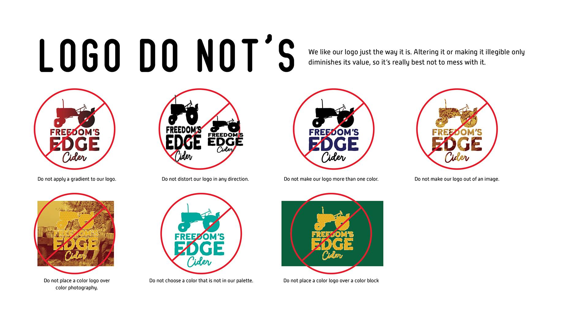
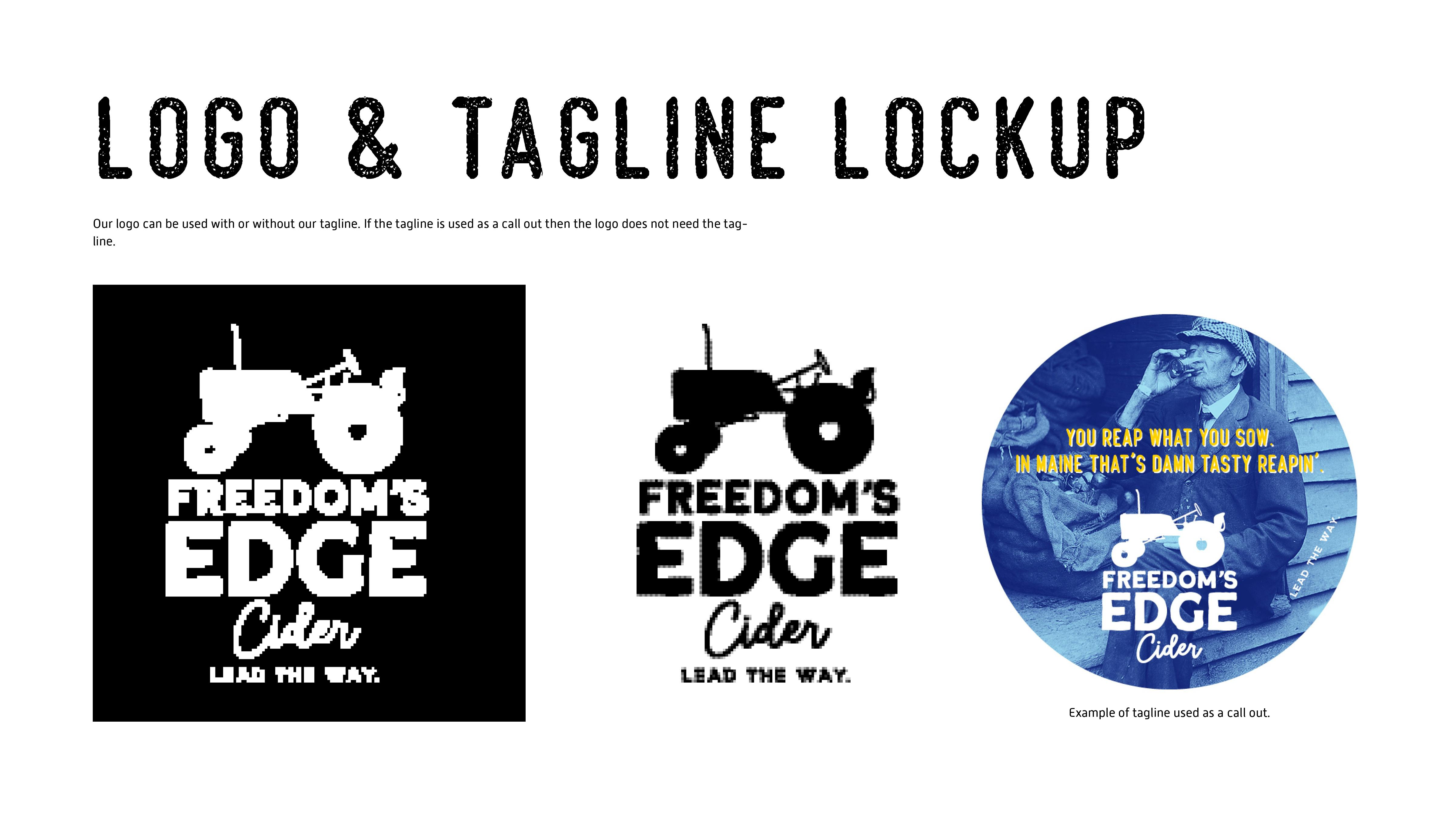
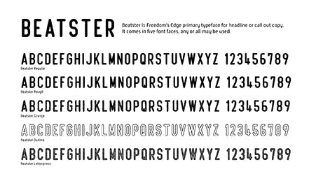
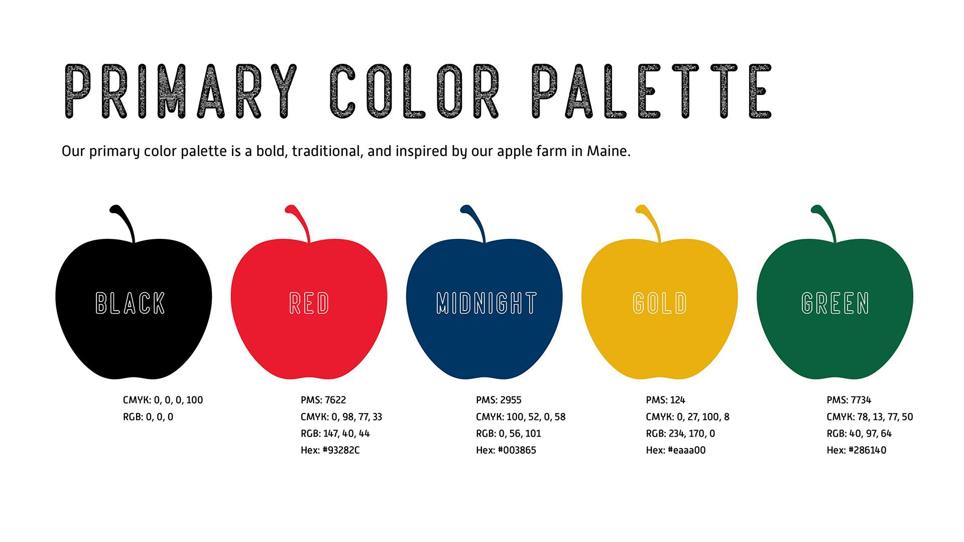
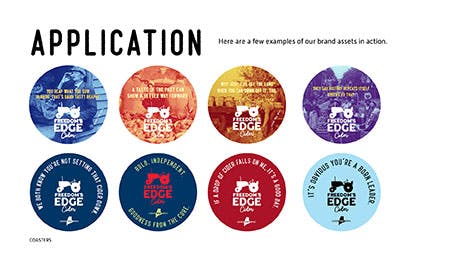
Building a bold, authentic brand system rooted in Maine heritage
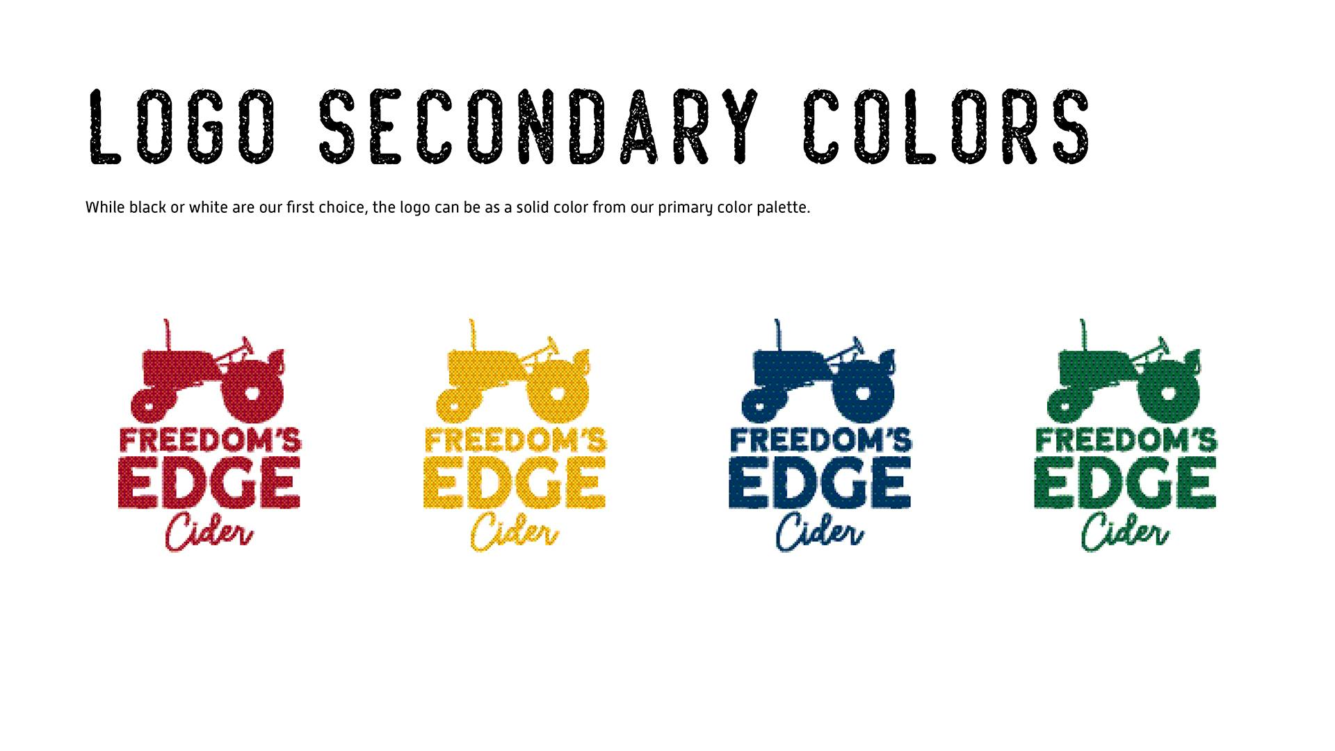
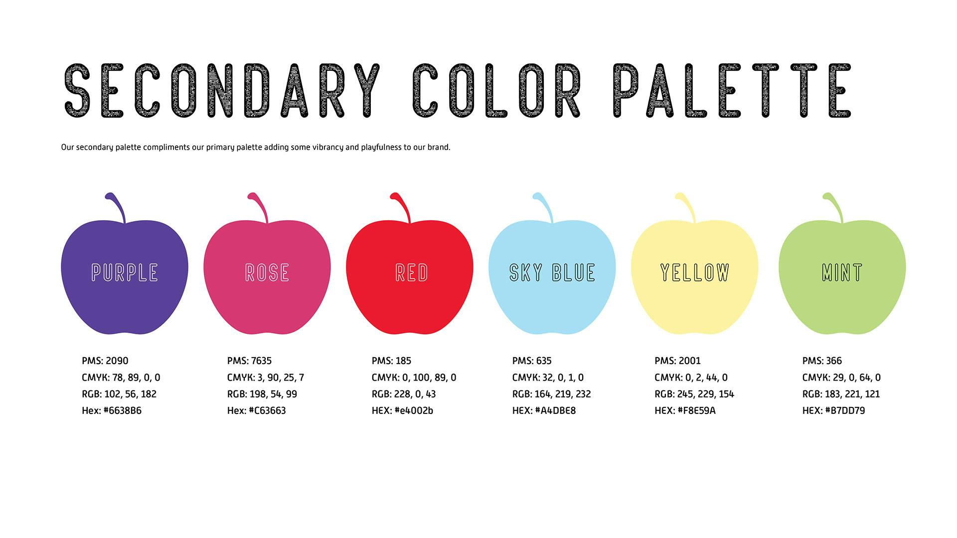
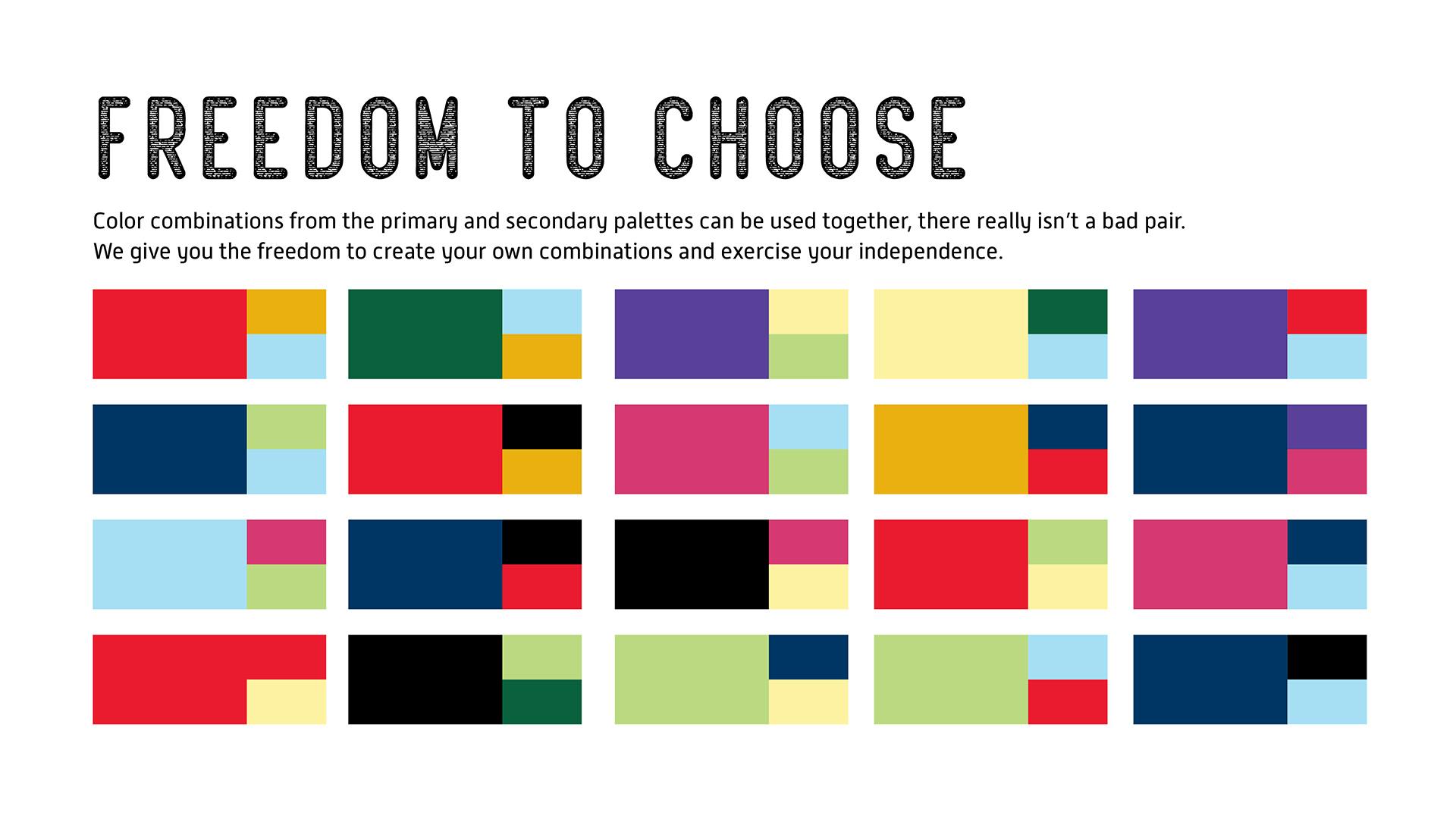
From color palette to can design, every element of Freedom’s Edge Cider was built with intention. The brand guide captured the heart of Maine’s cider tradition through a modern yet rugged design language—honoring history while carving a distinct path forward. nez&pez developed a complete system, including real archival imagery, that connects the brand to its regional story. This is a unified visual identity that’s instantly recognizable, scalable across packaging and merchandise, and true to its local roots.


Results:
Freedom’s Edge Cider went from zero awareness to a household name in Maine within a year. Bars and restaurants statewide now feature their distinctive tap handles, and the brand’s story has fueled rapid growth—maxing out production capacity and setting the stage for national expansion. From local orchards to national recognition, the brand’s authenticity is its edge.