How does a cybersecurity company reinvent itself with a brand that stands apart?
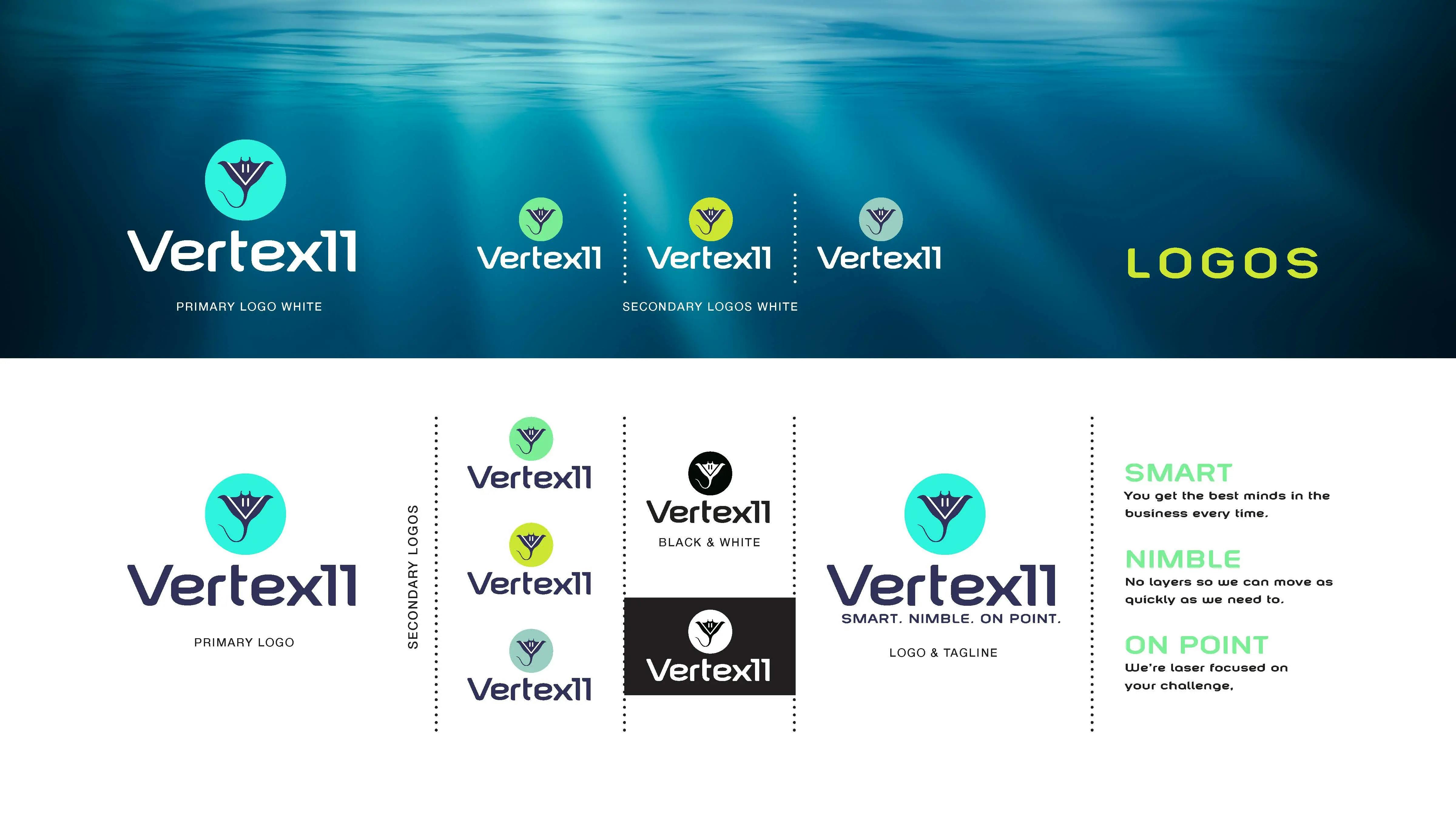
Creative Idea: The Manta Rebrand.
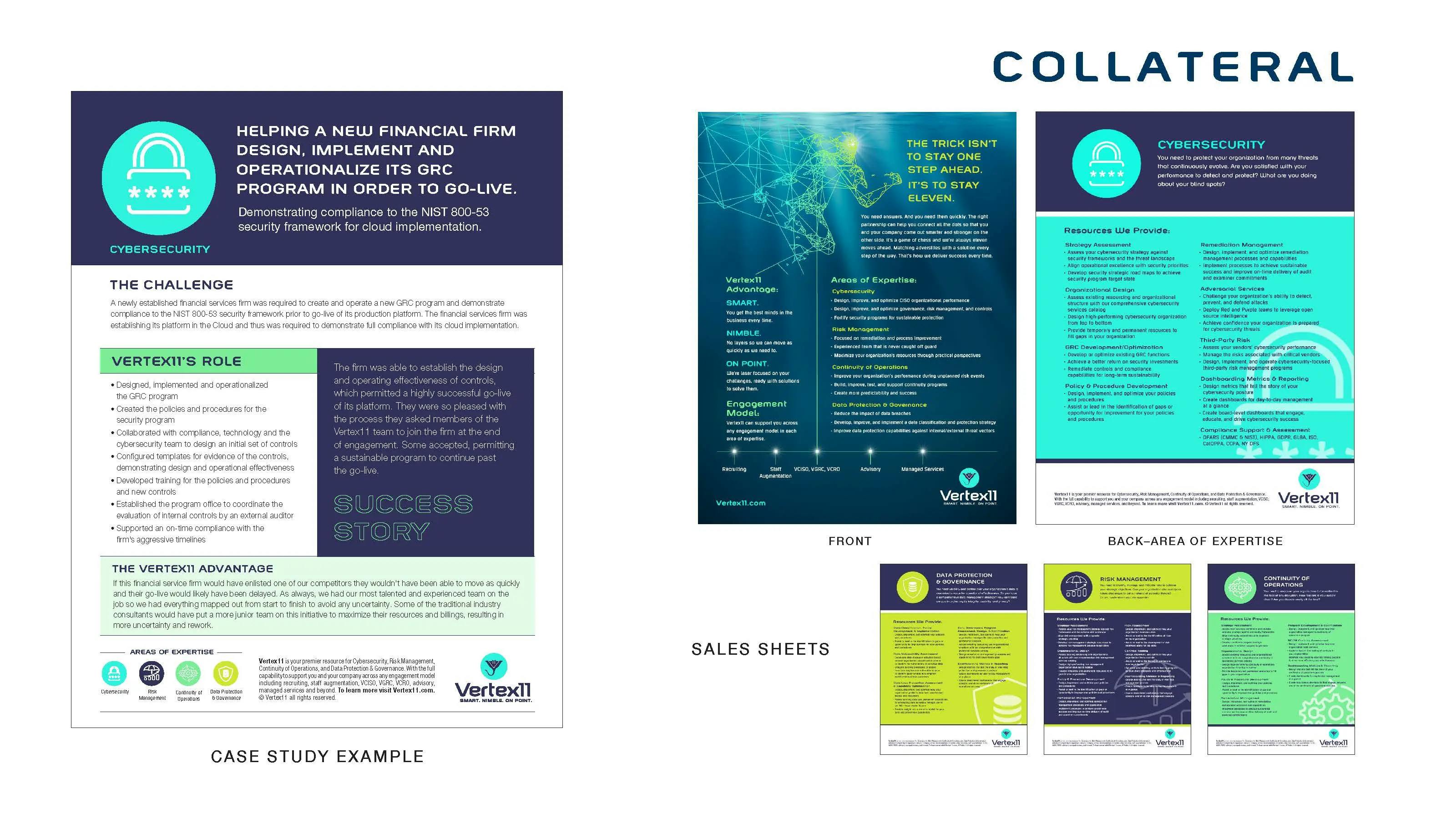
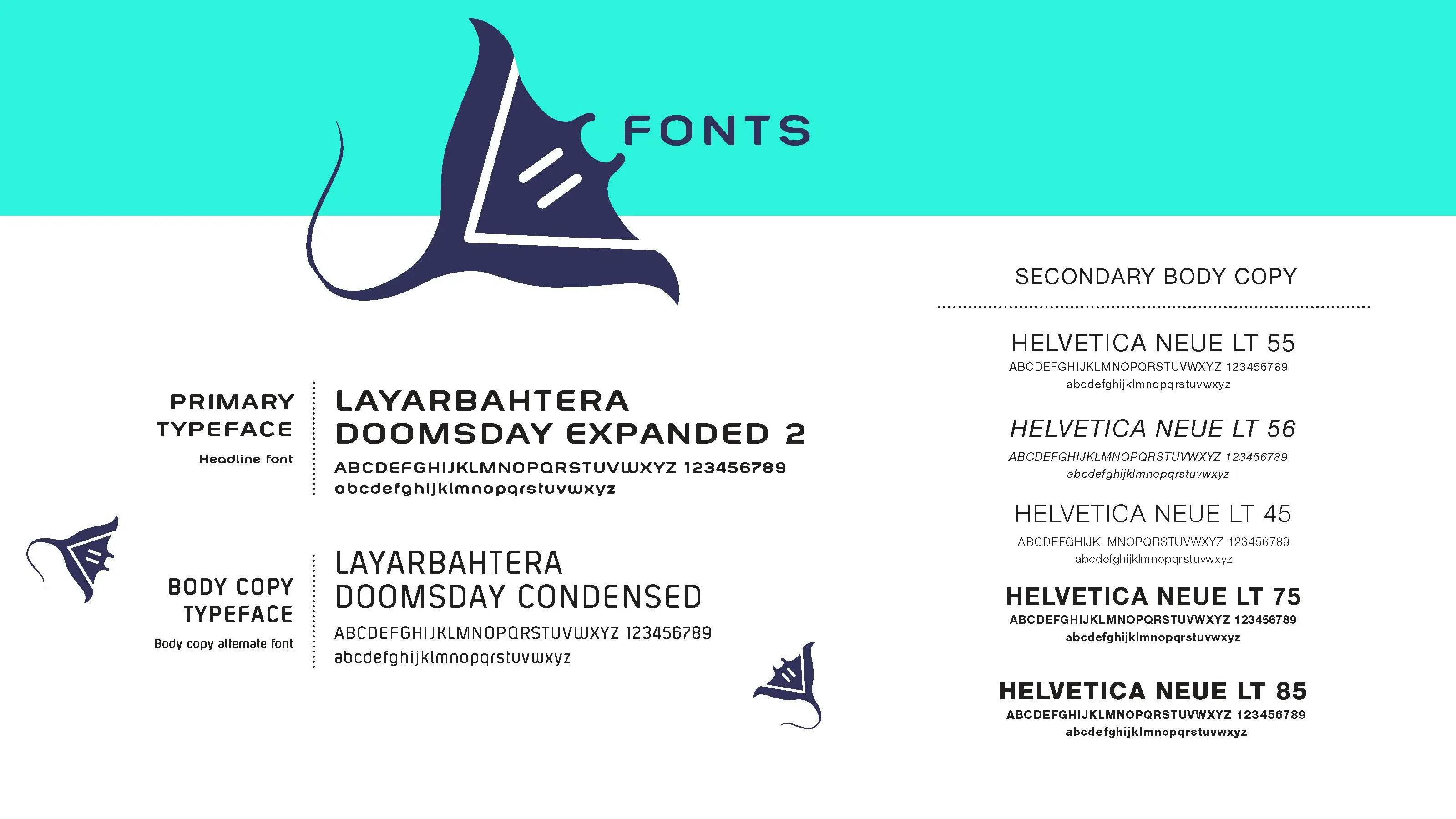
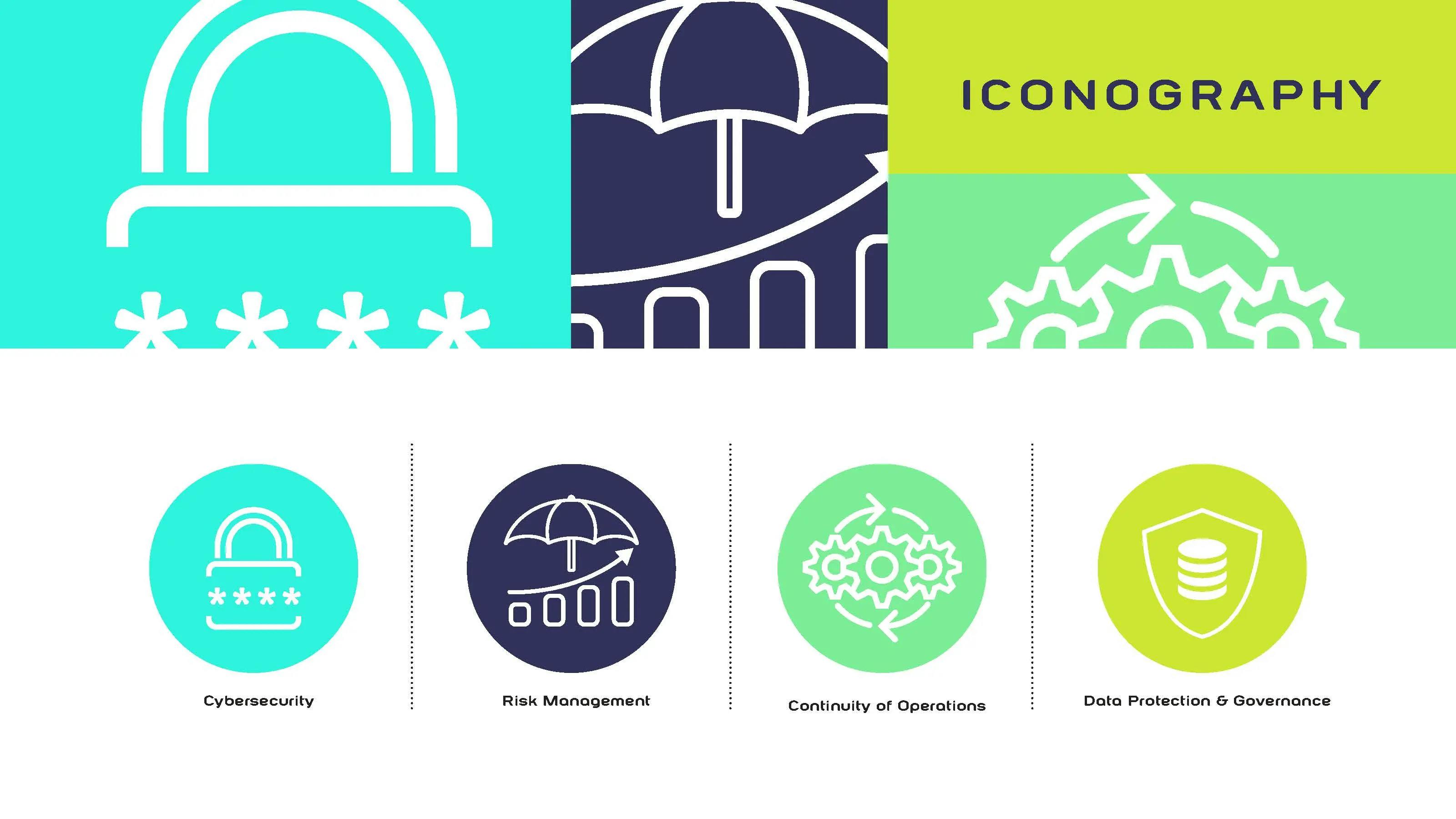
Vertex11 partnered with nez&pez to redefine its identity in a crowded cybersecurity landscape. Together with the founder, we landed on the manta ray as the perfect symbol for the rebrand — a creature known for intelligence, intuition, and self-reflection. What Vertex11 does for its clients is nothing short of superheroic. They deserved an emblem to match. We developed a bold new brand identity brought to life through a redesigned website, custom illustrations, case studies, social content, blogs, and newsletters — creating a cohesive, ownable voice and visual system that stands apart in the cybersecurity industry.
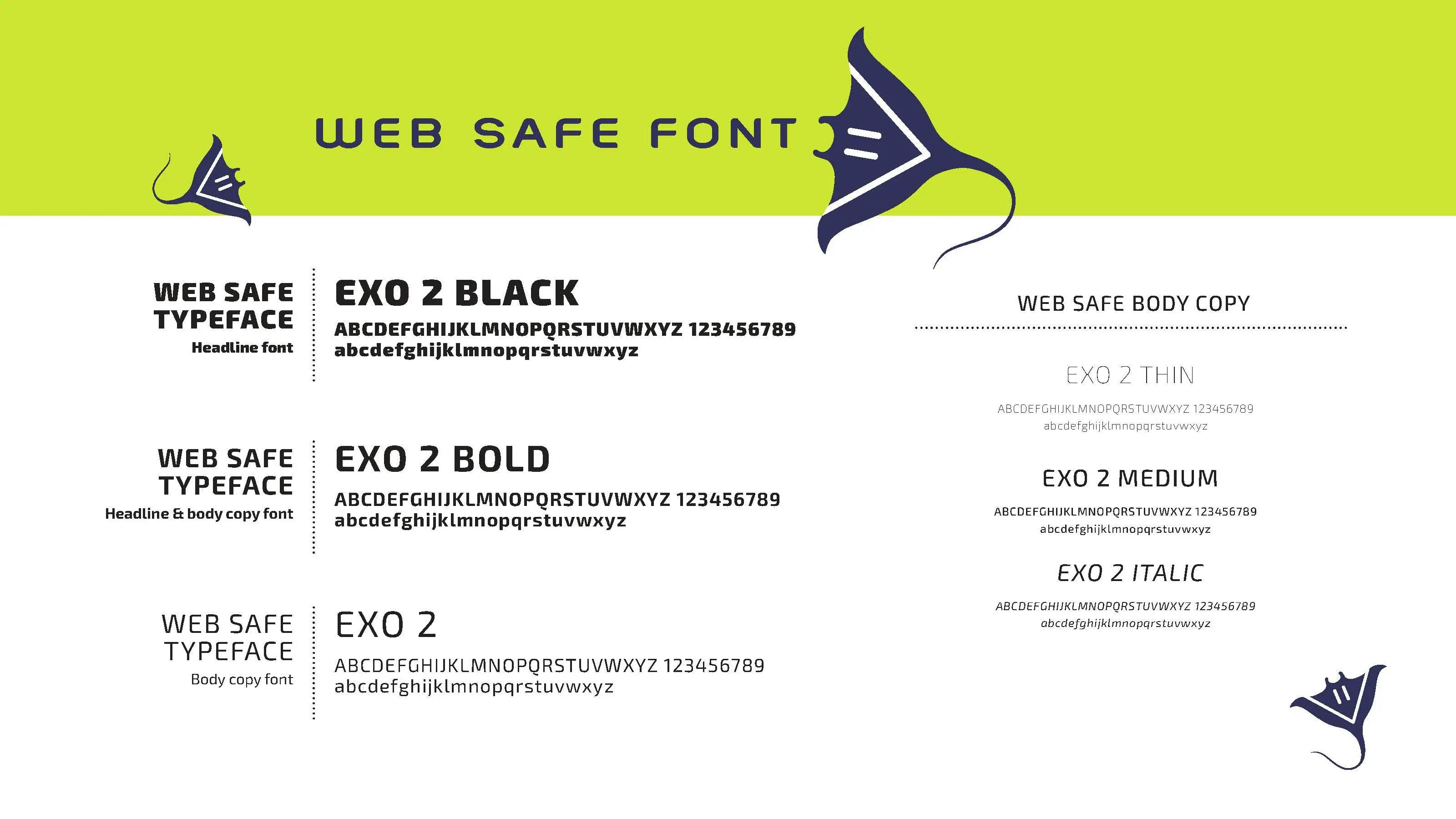
A New Look, Tone, and Feel
A modern identity built for clarity, confidence, and distinction in the cybersecurity space.


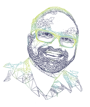
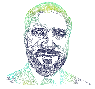
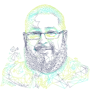
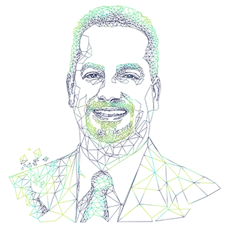
Unique employee headshots that reinforce the brand.


Brand extended across all touch points


This engagement reflects how nez&pez partners with cybersecurity leaders during moments of narrative expansion and market repositioning.
When this engagement works best
You’ll see the strongest results when:
- A B2B or cybersecurity company has strong product-market traction but lacks a clear, compelling narrative
- Positioning, brand, and go-to-market efforts are fragmented across teams
- Speed and senior-level decision-making matter more than high-volume execution
- The goal is clarity, alignment, and momentum—not incremental optimization
Results:
The Vertex11 rebrand established a stronger, more recognizable presence in the cybersecurity market, driving sustained increases in new business inquiries, social engagement, and overall brand visibility. The refreshed identity continues to attract top talent and new clients alike, reinforcing Vertex11’s position as a trusted, innovative partner in the cybersecurity industry. This project was delivered as a fixed-fee, senior-led engagement focused on positioning, creative alignment, and go-to-market clarity.